Week 5 Lecture Attendance Proof
Lumion Renders
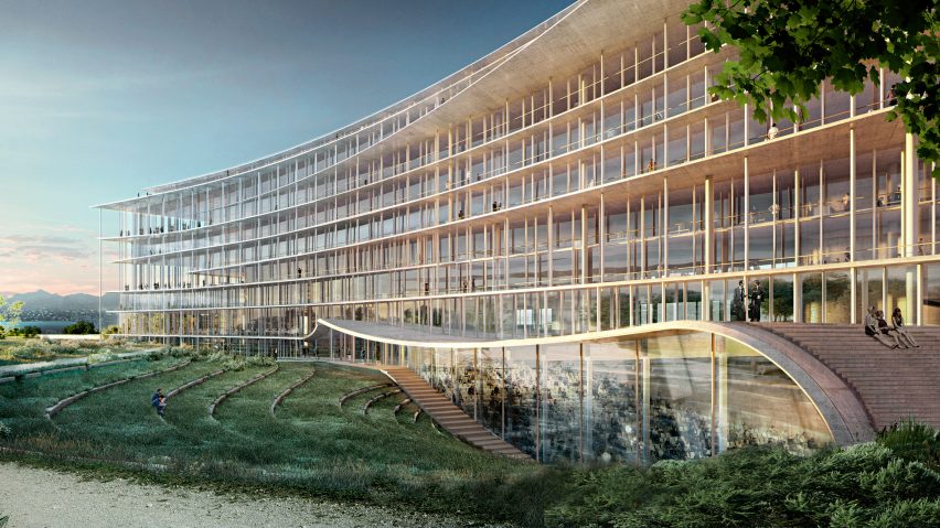
As shown above, the hybridisation of space can be seen by the large open windows which provide view from the interior and exterior. This removes the idea of walls enclosing on an individual, but rather, welcomes exterior views. This idea is carried onto the bridge where the twisted 'shell' warps the perspective of those who views it, as the interior and exterior views are very different. (With the exception of the studio spaces which remain the same, this prevents any potential conflict of room space or size.)
The Studio Space:
The studio space features 2 floors, each with 6 studio rooms for students and tutors alike to work in. Each room has a floor size of 42 square meters, which is more than enough space to fit 12 students in. Yes, the lecture hall was designed to seat 144 students total, hence these rooms should reflect the balance within the cohort.
The Gallery (above) and The Meeting and Office Rooms (inside and outside rooms respectively):
The Gallery space above is large enough to satisfy any artworks (sadly, i have not placed any in). The bottom floors are two office rooms and two meeting rooms. A partition wall separates the two meeting room, allowing for a larger meeting, especially between the students and teachers. Office spaces are smaller, but for 100 or so students, really only a handful is required.
The spiral stair case on either side of the block lead up and directly into the gallery. Also, each step is 150mm high, therefore, it would not be too much of a chore to walk up the steps. These are also the only real places that have stairs, other areas only have slight steps such as in front of the lecture hall and the bridge.
The Lecture Hall:
The exterior of the lecture hall is decorated with my personal textures, the small details make the lecture hall appear white in contrast to the black extrusions, and the grey frame. There are also small steps which lead up into the lecture hall, as well as an exterior space where individuals can relax or set up tables for post-lecture works.
The lecture hall is a large open space, featuring 144 available seats, and a 10 meter high ceiling, creating a very comfortable space for the students and lecturers. The space is also contrasted by the exterior shell which seems to make the lecture hall seem smaller in comparison, but in reality, the lecture hall takes up almost 1/3 of the entire length of the main building, reinforcing its size.
The Bridge:
This is the main focus of the experiment, therefore, needs to be as unique, if not, more so than the entire structure which intersects it. The bridge contains a wide, 3x3 meter walkway, surrounded by a 6x6 meter shell that is twisted and bent twice to create the facade of the bridge.
The Moving Element:
The first moving element are the elevators in the studio space, connecting the two floors. Since there is an elevator, stairs are redundant since these elevators are able to hold at least 20 odd students at once.
The second moving element is the sliding window outside the lecture hall. These windows on the outside prevent too much sun from entering the side windows of within the lecture hall, and can be opened to allow more sun in through the single window. Also, these windows help ventilate air, as when required, the interior window can be slid open as well, but these are the main ventilating items.
Link to SketchUp AND Lumion Models: https://www.dropbox.com/sh/8nsnuh7q7rre7jz/AACEt8X9JLJR_RSdL8c1z8iQa?dl=0


 (couldn't copy the image from the pdf!)